
Project Overview
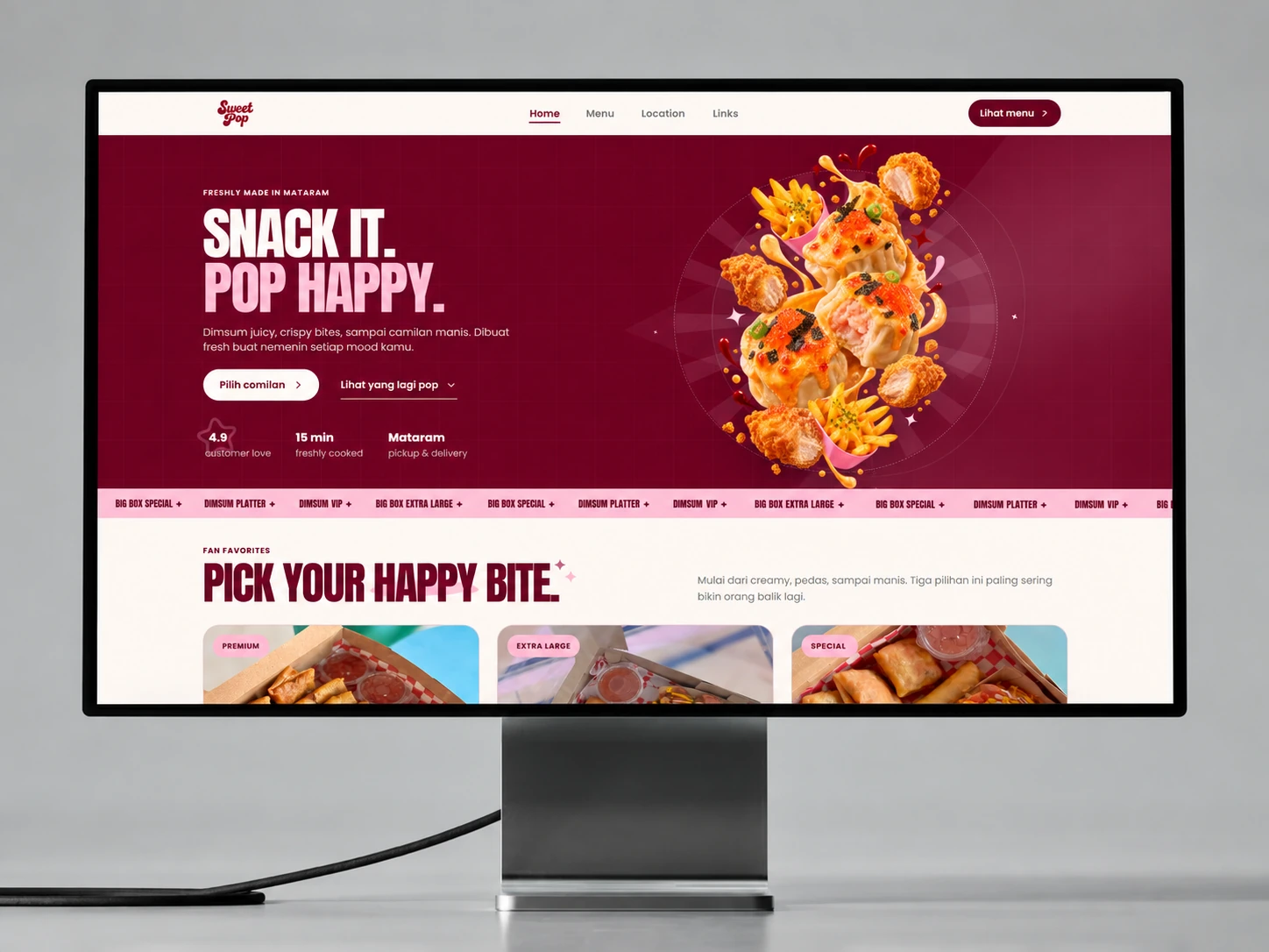
SweetPop needed a digital home that felt as energetic as the food itself while making it effortless for customers in Mataram to discover products, understand availability, and move into an order.
The Challenge
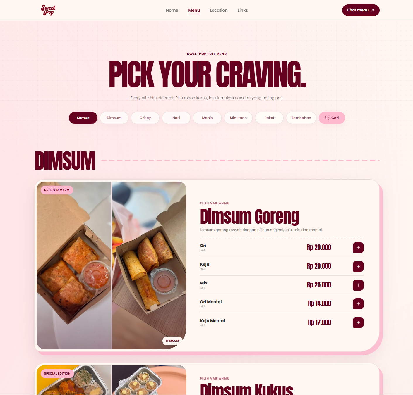
The brand had a wide, visually expressive menu, but that energy could quickly become noisy on a small screen. The experience had to stay playful without hiding categories, pricing, location details, or the next ordering action.
Priorities and constraints
- Keep the complete menu comfortable on mobile
- Preserve fast loading across image-heavy food pages
- Hand orders into WhatsApp with a useful summary
Decisions Behind the Work
The appetite created by the visuals should continue into an order that is easy to understand.
- Personality with a hierarchy
Bold food art still needs clear categories and prices.
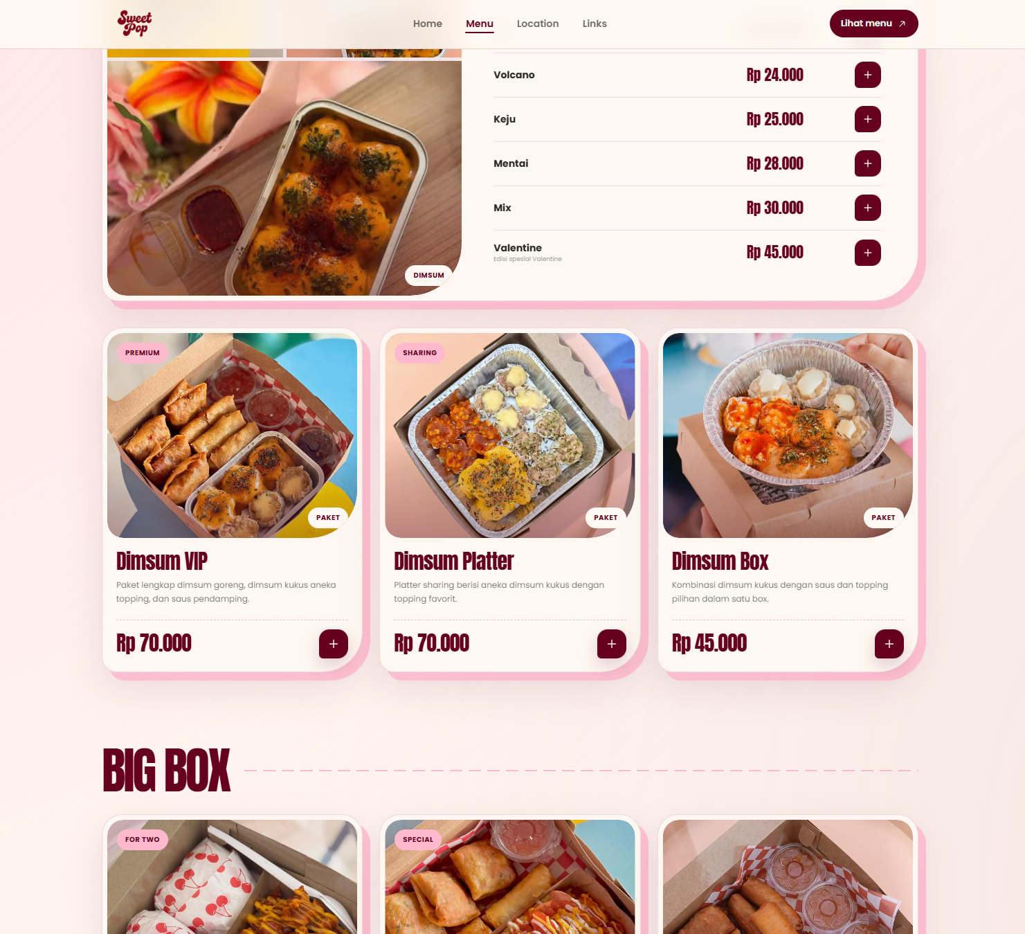
Oversized typography and campaign artwork establish SweetPop's energy. Menu filters, product details and availability cues provide the practical layer that makes that energy useful on mobile.
- Carry the order context forward
The handoff should contain more than a request to chat.
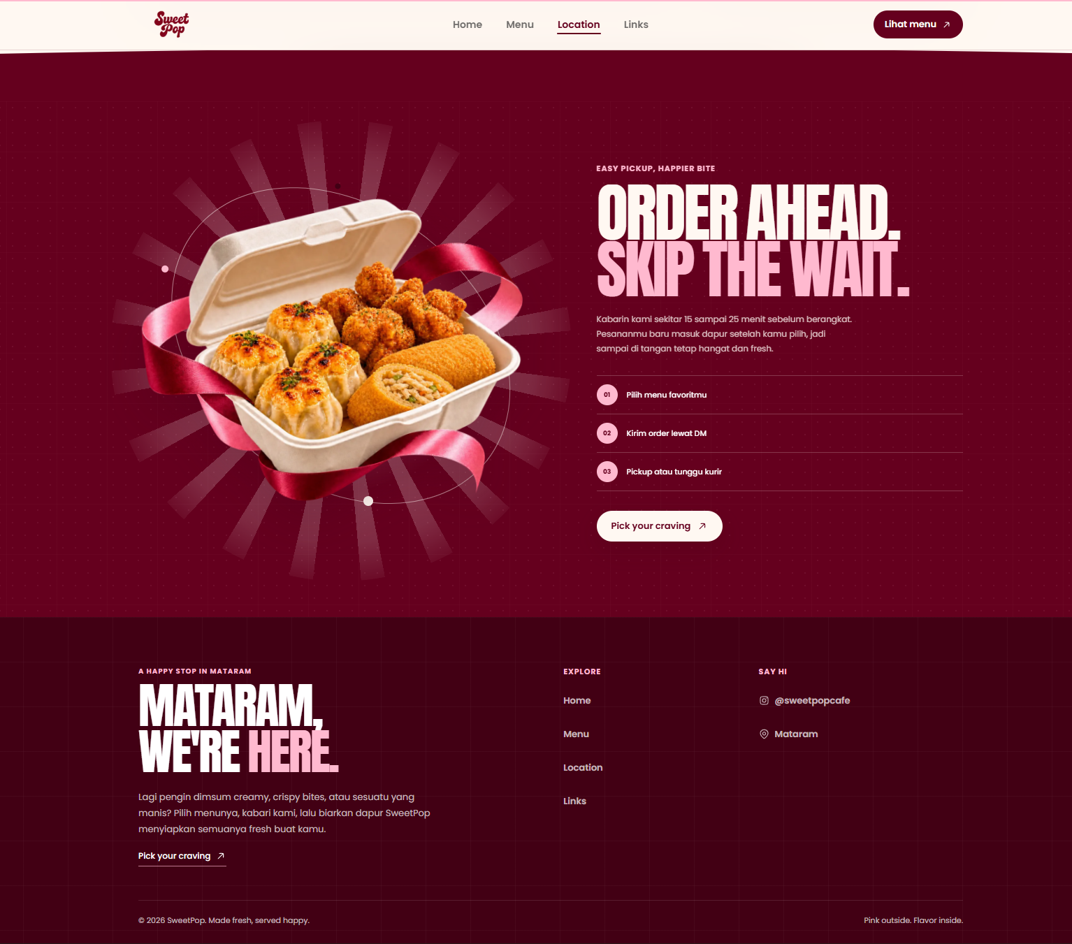
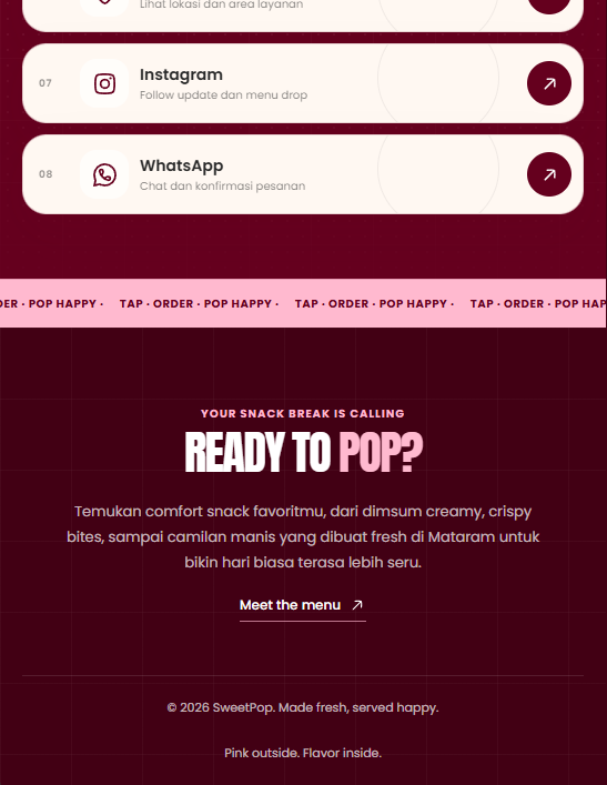
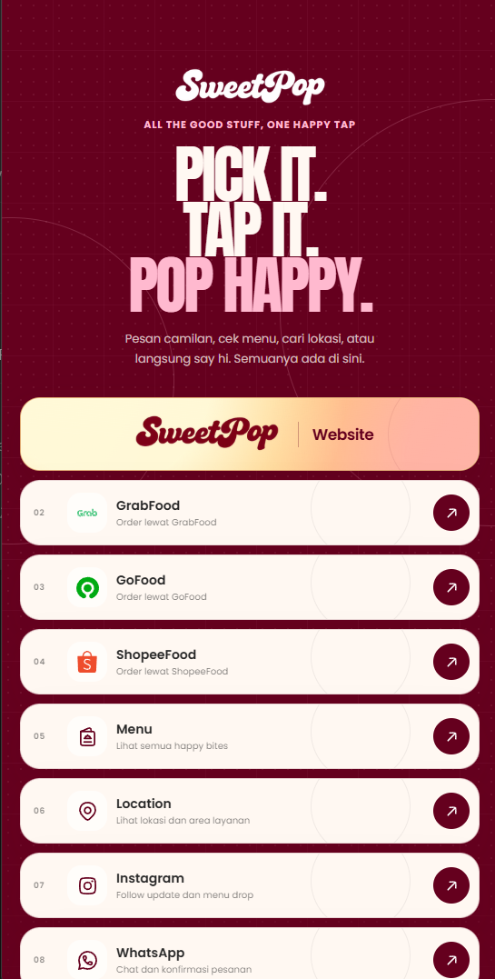
Selected menu items become a structured WhatsApp summary. Dedicated location and mobile-link pages keep discovery and practical information connected to the same ordering destination.
The Solution
We built a responsive brand system around oversized typography, rich food art, clear category filters, and a persistent order flow. Menu selections are translated into a structured WhatsApp message, while dedicated location and link pages keep every customer path connected.
What we delivered
- Brand direction
- Web design
- Commerce flow
- Development
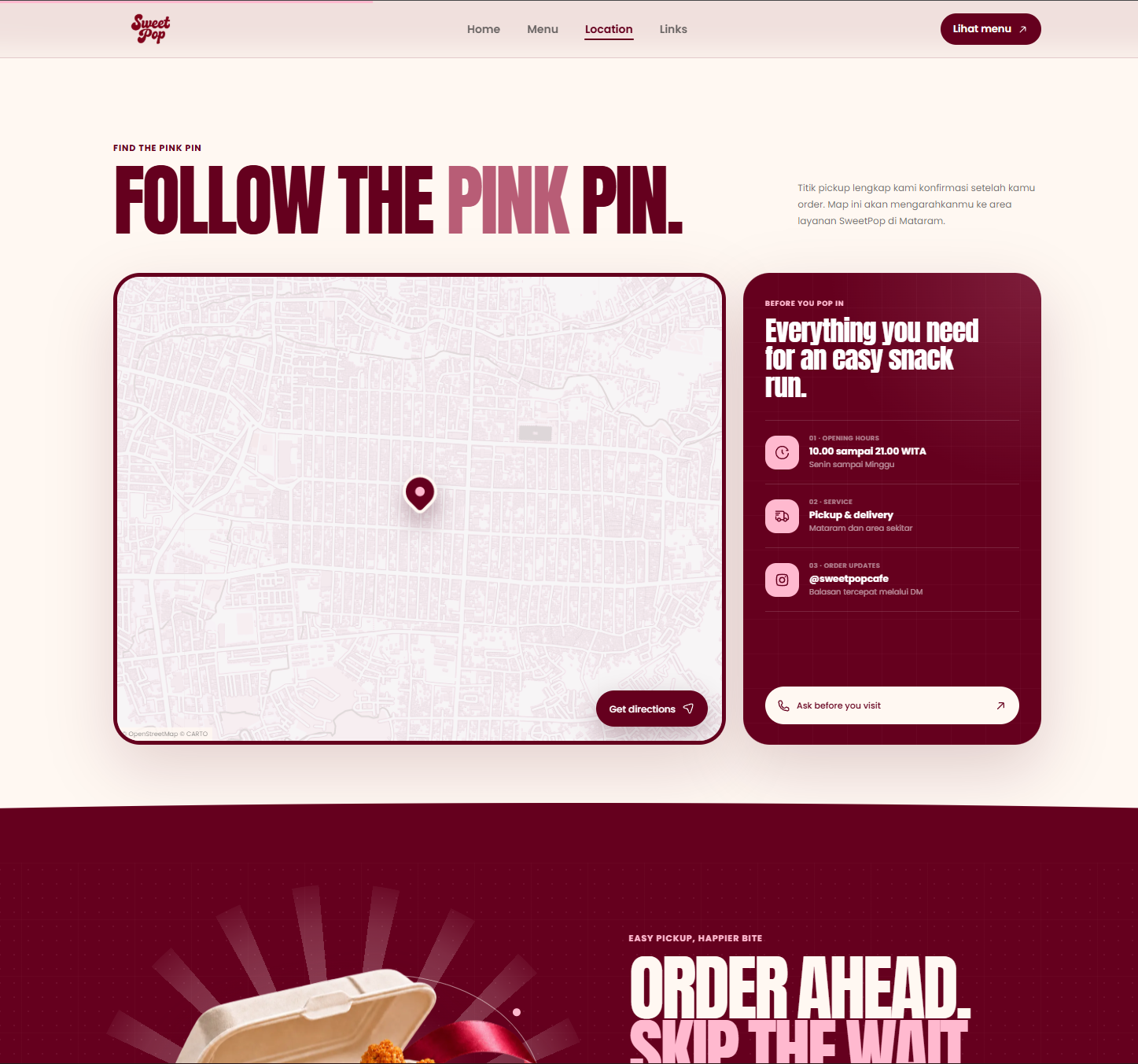
Bold visuals, clear decisions.
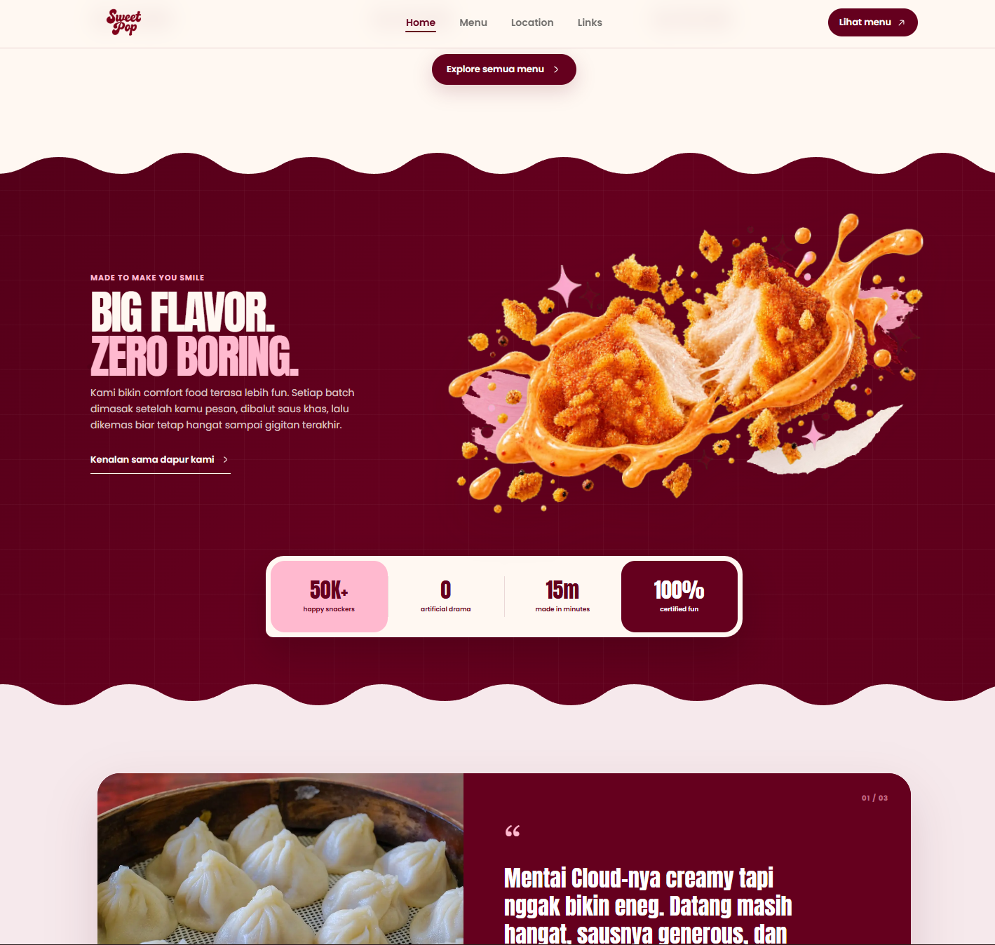
Every expressive food moment is paired with clear category, price, availability, and ordering cues, so the personality never competes with the next action.
- Discover quickly
- Choose confidently
- Continue to order
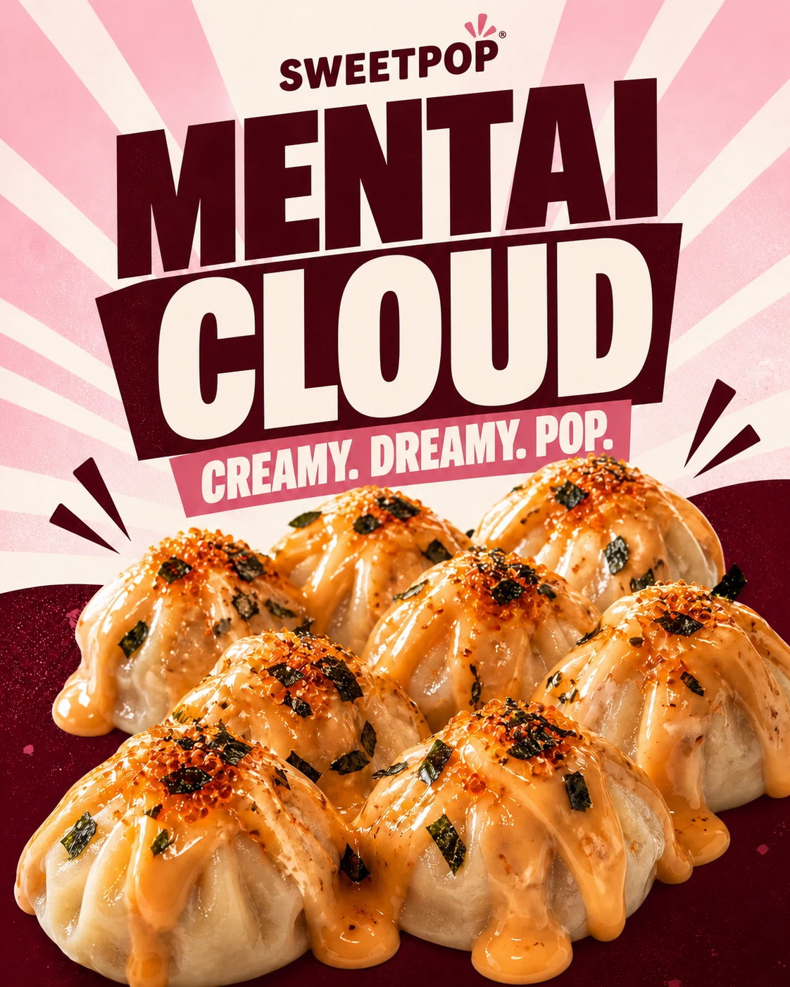
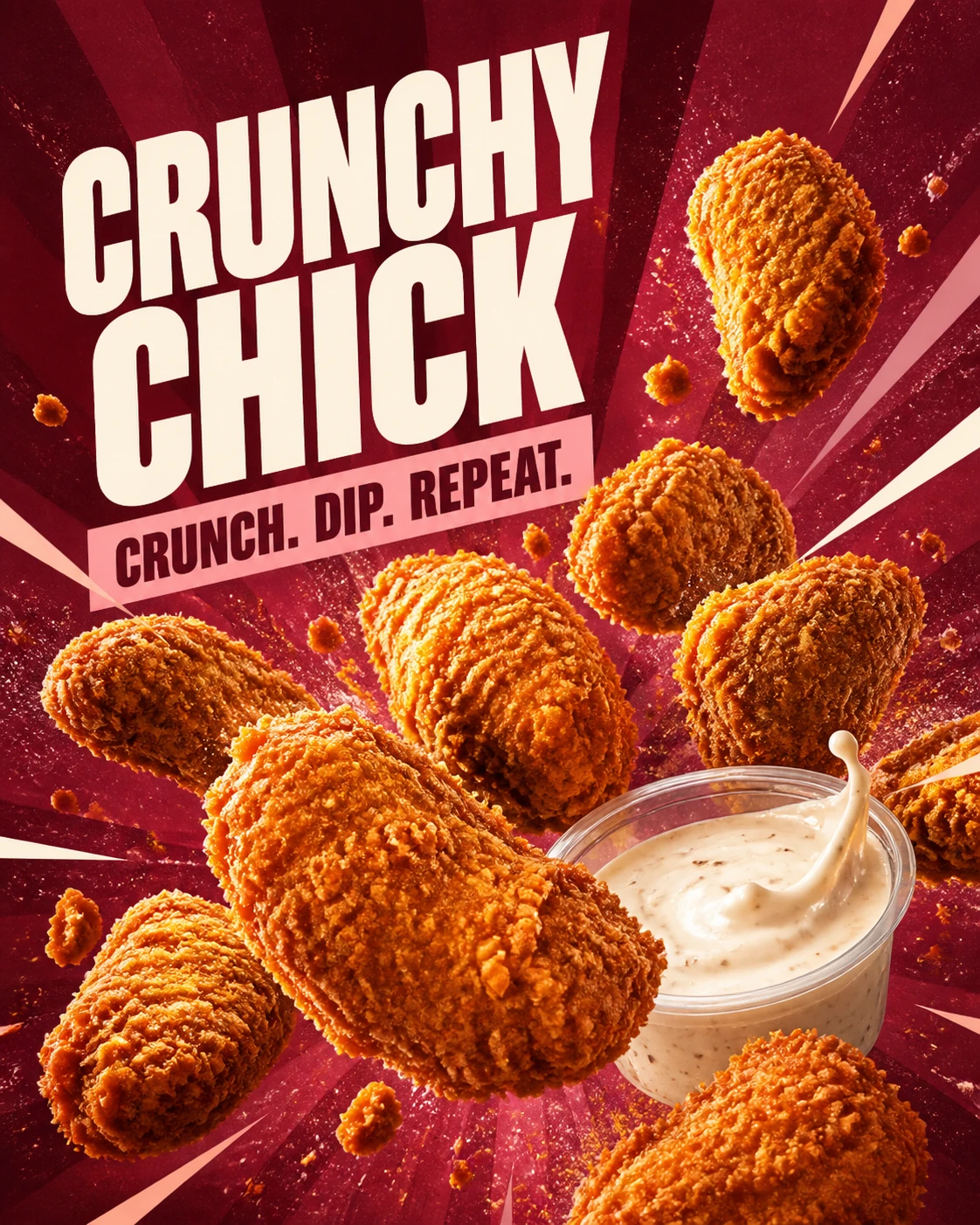
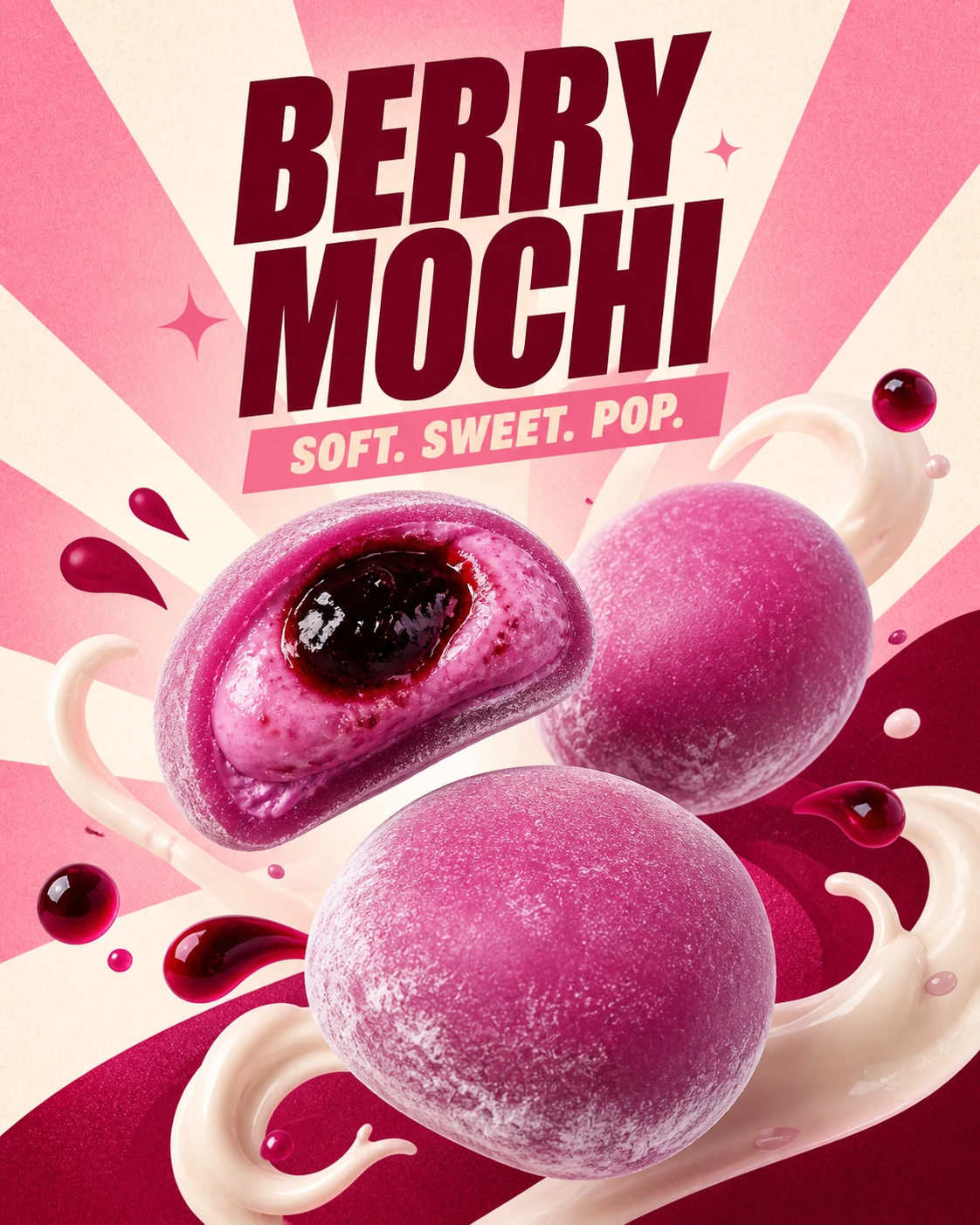
Campaign energy, one identity.
Campaign posters, mobile links, menu pages, and location content share one visual language instead of behaving like separate promotional pieces.
- Food-first art direction
- Consistent typography
- Connected customer routes
Built Around Its Users
Customer
Discovery and ordering
A visual path from product discovery to a confident order without losing the playful brand character.
- Browse signature products
- Understand variants quickly
- Continue to a clear order
Store team
Daily order handling
A straightforward operational view for receiving demand and keeping product information consistent.
- Review incoming requests
- Keep product data aligned
- Reduce repeated questions
Brand team
Campaign consistency
A reusable visual system that keeps campaign assets, product stories, and ordering moments in one language.
- Reuse campaign patterns
- Protect visual consistency
- Launch products faster
“A food brand should feel as satisfying on screen as the first bite feels in person.”
Impact
A bold food website that turns SweetPop’s playful identity into a clear menu and ordering journey.
- Connected customer routes
- 4
- Clear menu categories
- 7
- Direct ordering handoff
- 1